Intention
A macOS timer that trains you to think more often.
Available on the Mac App Store. Designed and built by one person.
Challenge
Have you ever gotten to the end of a long work day and realized you spent the wrong amount of time on all the wrong things? I have.
The obvious solution was a timer. Unfortunately, if you use timers a lot, you learn to dismiss them reflexively. And it’s really easy to forget to set the next timer.
I designed and built Intention, a macOS app that asks what I’ll focus on and gradually blurs the screen if I don’t set the next timer.

Process
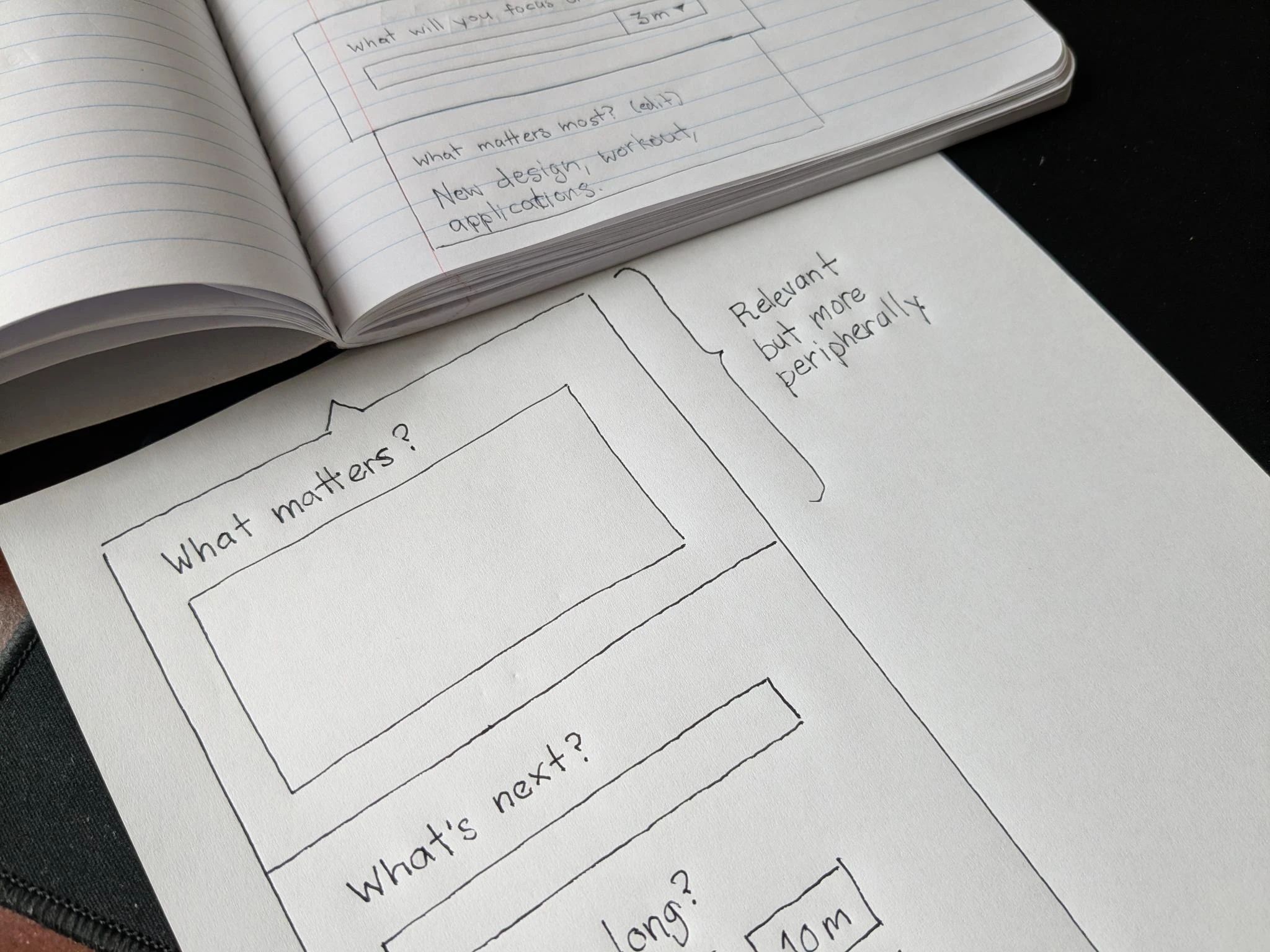
In the past, I would have begun by sketching some solutions, putting together a clickable prototype, and user testing that. But how much does that user test actually test? A traditional prototype in Figma is paper-thin. I’m testing much less than the full experience.
I much prefer to sculpt functional software as I go. I build something, use it, notice what’s wrong, and fix it in the same session. Tools like Cursor and Claude Code make this method of working far more efficient and practical.
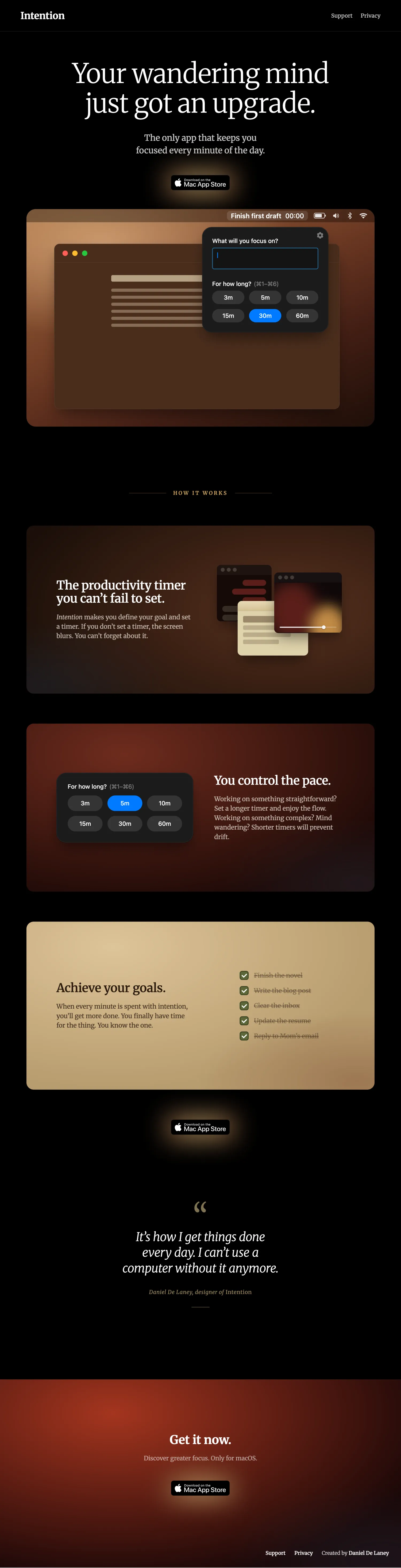
Craft
The UI conforms to the macOS look and feel, without calling undue attention to itself. The visual inspiration for the brand, however, is the early 1600s Caravaggio painting Saint Jerome Writing. In it the aging scholar Jerome, remembering the nearness of death, absorbs himself completely in the most noble work he can find to do while ignoring everything else. This is our task.

The dock icon was drawn in Figma with the pen tool and layer effects. The candle in the dark serves as both a metaphor for the app’s purpose illuminating the way forward, and an allusion to meditative practice.
The same visual language carries through to the landing page, in Merriweather with warm gradients pulled off the painting. Three feature panels carry the product’s three claims, each in its own slice of the palette: a deep brown for the blur mechanic, a dark red for the timer grid, a cream for goals checked off. I make heavy use of animation to convey the product’s behavior and value.
Design decisions
Intention doesn’t prevent you from opening anything. A site blocker is something I’d turn off the first time it inconvenienced me. A prompt asking what I’m doing is simply inviting me to be aware of what I’m doing.
You can’t dismiss it without starting a new timer. A simple dismiss would train people not to use it.
The duration is the timer start; picking a duration starts the timer in the same motion. No Begin button, no confirm step. The first version had a separate Begin button, which got old in actual use quickly.
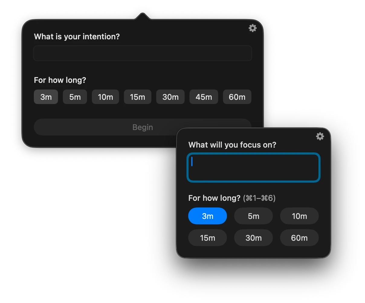
Keyboard-only users are first-class citizens. ⌘1 through ⌘6 picks a duration and starts the timer. The text field is focused the moment the window appears. I noticed early that 3-minute timers were a pain if I had to reach for the trackpad every cycle. Full keyboard coverage took some work, but it was the difference between using the app and abandoning it.
A gradual blur is the only way. I tried a black overlay. I tried a system modal. Neither works. The user needs an opportunity to finish their thought. An immediate, hard barrier just frustrates and prompts uninstalling. Instead, the blur builds slowly. The user keeps working as it comes in, but also notices that it’s time to switch on metacognition.
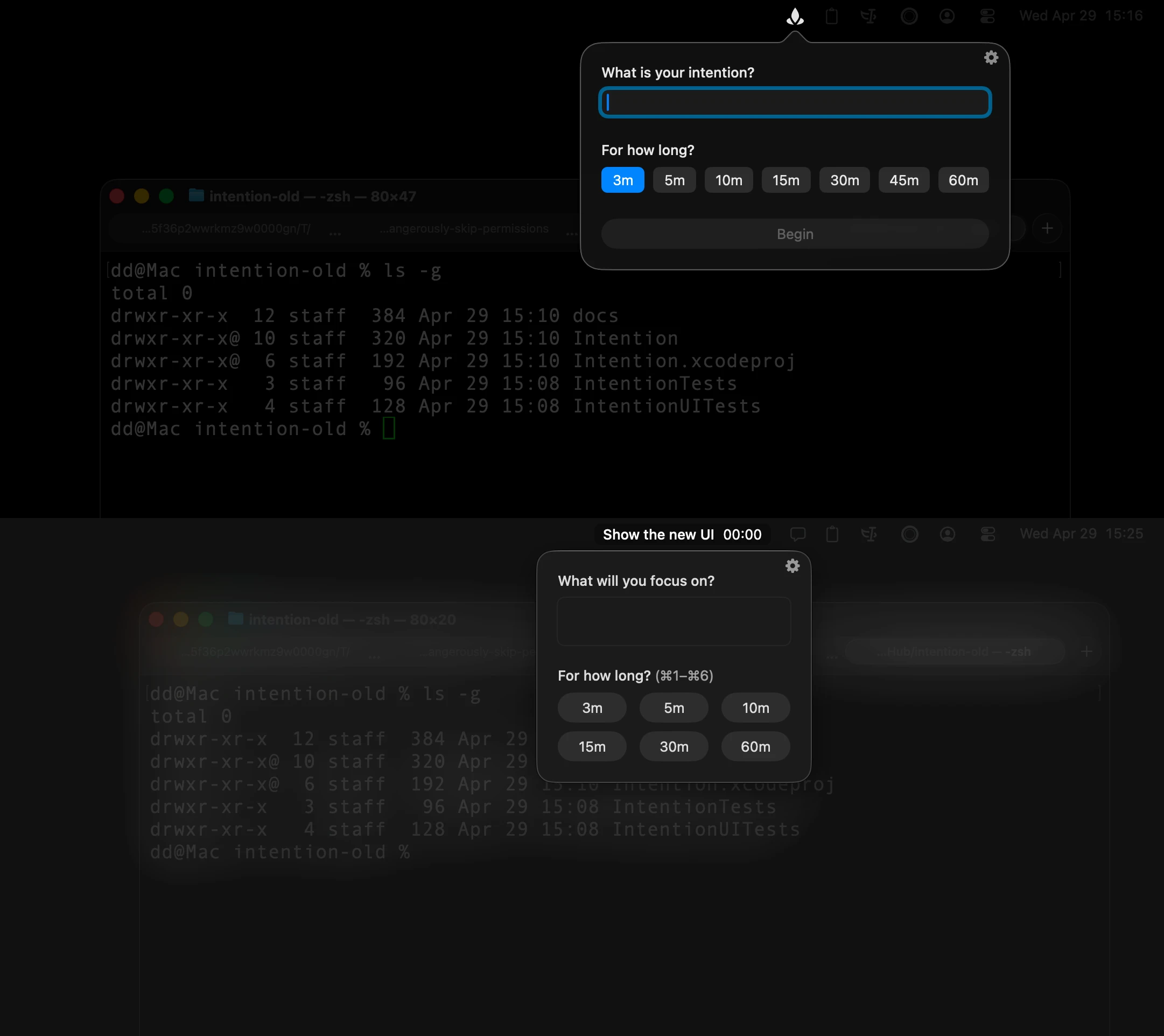
You might expect intention to be menu bar only. The app never grabs keyboard focus, but you still need a fast way to switch to it when you’re ready to answer. Intention appears in the dock so Cmd+Tab works.
Living with it
This small intervention has worked beautifully. Not only am I catching unproductive divergences earlier, I’m noticing fewer of them over time. It seems to be training me to do more and better thinking.
If I’m making great progress on something that doesn’t require much thinking, I can set the timer for a longer duration, maybe 30 minutes. But if I’m working on something more open-ended, I might tighten the leash all the way down to 3 minutes. Then I can’t get off track.
I can’t fail to set the next one. If I don’t answer it promptly, the screen gradually becomes less readable until I do. If I wanted to avoid answering, I’d have to make a conscious decision to close the app. I’d have to decide to be less productive. I never do.