LanWhisper
Voice typing that uses the faster computer already on your network.
Every token and component used across danieldelaney.net, in one place. Yes, it's big for a personal site.
Every named colour and surface token from :root. ::selection uses --accent on black; code elements use --accent on --accent-10.
--shadow-color is the one neutral darken: it tints drop shadows on images and provides the background for the .veil recipe (see Lightbox & veil). --veil-blur is the backdrop blur radius the recipe pairs with it.
--shadow-color — rgba(0, 0, 0, 0.75). Tints box-shadow on images.
--veil-blur — backdrop blur radius for .veil
Family, scale, tracking, and line-height. Defined in :root.
--font-body — Source Sans 3: body copy, paragraphs
--font-mono — Source Code Pro: headings, eyebrow, code
--root-size is the body font-size: 18px below the 120em viewport, 22px at and above it. If a design needs a sixth step, the design is wrong before the scale is.
--fs-xlH1--fs-lgH2--fs-mdH3 / lead--fs-baseBody--fs-smCaption / fine print--track-caps — 0.08em. Uppercase tracking used by the case-study badge and the home .more-link CTA pill.
--lh-tight — 1.2: headings, hero titles, quoted display copy
--lh-base — 1.5: body copy, paragraphs that run more than a couple of lines
The raw scale. Use these directly only for component padding and other non-rhythm needs. For any vertical gap that creates rhythm, reach for the named tokens in the next section instead.
--sp-1--sp-2--sp-3--sp-4--sp-5--sp-6--sp-7--sp-8Vocabulary for vertical rhythm. Four named tokens, each bound to a specific value from the spacing scale. Every vertical margin and gap on the site references one of these — there is no "tighter than pair" tier, since gaps that small (figcaption inner stacking, list-item separators) are noise and we let line-height do the work instead. Bars below show each gap rendered between two stacked blocks.
--rhythm-pair = --sp-2 — between a heading and its content (h1→lede, sample→figcaption, h2→lede)
--rhythm-row = --sp-3 — between siblings (.stack rows, p→p, h2→content in prose)
--rhythm-block = --sp-5 — between distinct blocks (.lede→content, image margins, h2 top margin in prose)
--rhythm-page = --sp-7 — page-level (main edges, .apps→writing, footer top, design-system section breaks)
Bars rendered at actual size; wider measures overflow the right edge of the page and clip via overflow-x: hidden on the body.
--measure — 38em: prose column max
--measure-wide — 64em: wide layout cap (home grid)
--measure-hero — 16em: home hero text-wrap width
--gutter — 2em
Two weights. Thin is the standard hairline (cards, dividers, headers). Thick is reserved for emphasis bars on quoted blocks and callouts.
--border-thin — 1px
--border-thick — 3px
One aspect ratio for any card-shaped vignette. Used by the home app cards and the case-study carousel.
--aspect-card — 16 / 9
There is no --radius token. Sharp corners are the baseline. The only exception is demo animations that imitate native OS UI, where rounding helps sell the illusion.
All durations share one easing curve. Page-level transitions, hover state, and image fade-ins draw from the same handful of tokens.
--dur-fast
--dur-med
--dur-slow
--ease-out — one curve, used everywhere. Standard ease-out: fast start, gentle landing.
.fade — page enter: opacity 0 → 1 with an upward translate of --page-enter-y (8px), over --dur-slow. Applied to <main> in the base layout (every layout except home, which stages a per-block stagger instead).
--lift — translateY(-2px) over --dur-med. Hover transform applied to every .card. The card recipe (see Cards) combines this with a border and background change; this row isolates the lift itself.
--hover-dim — opacity 0.6 on hover, transition over --dur-fast. Opacity target for icon-only buttons (carousel arrows, lightbox close). Used instead of card chrome where the affordance is the icon itself.
loading="lazy" start at opacity: 0 and fade to 1 over --dur-slow when a .loaded class is added on the load event (inline script in _layouts/base.html). Prevents the snap-in flash that lazy decoding otherwise causes. Carousel slides have their own variant: same transition, but the visible frame is gated by .active.
h1 — page title
h2 — section heading
h4 — accent green, used inside cards
.lede — intro paragraph after a heading
A lede paragraph that introduces a section. Capped at the body measure, with muted text.
.meta — small mono caption for dates and eyebrows
.section-label — large section label on the home page
<strong>, <em>, and inline code
This is a paragraph. It contains an inline link with the animated underline, then bold text in white, plus italic text, and inline code rendered in mono on a faint accent panel.
<ul> — unordered list (square bullets)
<ol> — ordered list
<blockquote> — default pull quote
“A standard blockquote: muted text, generous padding, thick neutral rule on the left. The .callout variant just swaps the rule colour and adds an accent fill.”
.stack — vertical flex with rhythm gap
img.bordered — surface-coloured 1px border
img.int-icon — small centered icon (defined in case-studies/intention.css; case-study-only, 260px wide, auto-margins)
<video autoplay loop muted> — looping silent video block. Renders the same as a regular image: full-width block with rhythm-block vertical margin. (Still shown in place of a video below; the video element behaves identically.)
<figure> + <figcaption> — image with a mono, faint caption set tight beneath it. Use for attribution or context, e.g. flagging that a hero is an illustration, not a photo of the real thing.
img.img-phone — portrait phone screenshot capped at 360px and centered, so a tall mockup doesn't stretch to full column width
.callout — accent-coloured prominence block (applied to a <blockquote>)
Key outcome: A callout looks like a blockquote, but with an accent rule, faint accent fill, and accent-coloured strong text.
.hero — typography statement on the home page
.more-link a — accent CTA pill used under home sections
Default .more-link wrapper has margin: var(--rhythm-page) 0 (6em top & bottom). On the home page, .apps > .more-link and .writing-cards + .more-link override the top to var(--rhythm-block) (2em) so the first more-link sits closer to the cards it follows. The Case-study-return section below shows the centred variant.
.badge — case-study eyebrow (static)
.badge-link — back-link version, used at the top of a case study (composed with .badge for the visual chrome)
.card — generic card primitive (hover lifts and shifts to accent)
.card.project — portfolio index card
ul.writing-list > li > a.card — writing index list rows. Reuses .card for the box, border, and lift hover; the wrapping .writing-list just resets the list and (on wide screens) floats .date to the right.
.writing-card — quote-led .card variant on the home page
.app-card — home-page product card (vignette + label area, no border on text). The bordered region is .app-vignette.
.more-link.more-link--center — centered variant at the foot of every case study; same accent pill, just centered, with extra room below (margin-bottom: var(--sp-8)) before the footer.
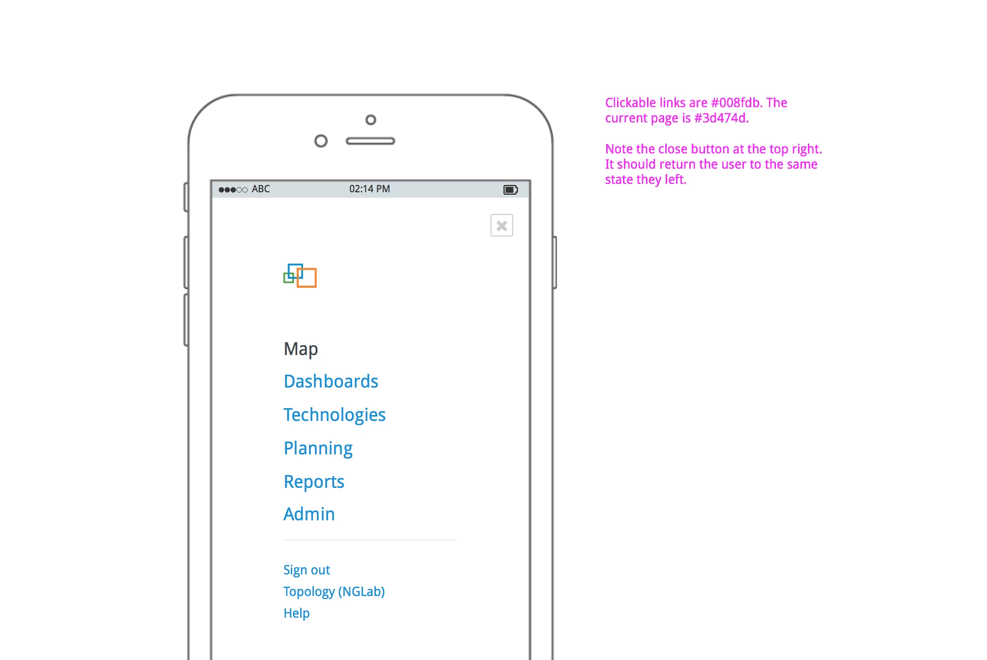
Site chrome that sits above every page (already rendering at the top of this one). Sticky, veil-blurred, with a 1px surface-coloured bottom border. Demo below has sticky behaviour stripped so it sits in the frame.
<header class="veil"> — full assembled header (logo + nav). Layout is flex with justify-content: space-between — logo pinned left, nav pinned right. Padding is 1em var(--gutter).
33.75em (~540px), email collapses below 23.75em (~380px). Try narrowing the window to watch the swaps fire on the live header at the top of this page.
.logo-full ("Daniel De Laney") shows by default; .logo-mini ("Dd") shows below 33.75em..email-full ("hello@danieldelaney.net") shows by default; .email-short ("E-mail") shows below 23.75em.--text-faint by default and transitions to --accent on hover..carousel — slideshow with a veil-blurred control bar pinned to the bottom of the slide area. Prev/counter/next sit on the left, a prominent accent-green .carousel-fullscreen-btn sits on the right. Click anywhere on the slide area (or the fullscreen button) to toggle fullscreen. Under 40em, Prev/Next become arrow glyphs, the counter compacts to X/Y, and the fullscreen button label drops to Full / Exit. The fullscreen state portals the carousel to <body> via JS so it escapes any ancestor stacking context; a sized placeholder <div> holds the carousel's slot in the document so the page doesn't jump on enter/exit.
.veil — dark + blur surface used by the header and lightbox
.lightbox — clickable image opens a fullscreen modal. Live behaviour: in _layouts/post.html, every article img attaches a click handler that clones the image into .lightbox.veil, fading in over the page until clicked or Esc. Frozen sample below.
figure.git-log — terminal-style commit log with fade-out mask
.lw-tabs-stack — old version top-left, new version overlapping into bottom-right
The three product vignettes used on the home page. Each runs an autonomous animation loop driven by /js/home-vignettes.js.
.lw-vignette — listening bars that swap to the transcribed phrase
.int-vignette — typed-prompt morphs into a green-bar countdown
.mb-vignette — file drag arc + dashed drop zone + progress + done check
The interactive macOS-style hero from the Intention case study. Four activity templates cycle behind a dim/blur veil while the Intention popup card prompts and confirms.
.intention-hero-scope
The voice-pill + window animation from the LanWhisper case study, in its hero size. Cycles through three windows (terminal, Messages, editor) with the pill rising, listening, and dropping a transcribed phrase at the caret.
.lw-demo-scope.lw-demo-scope--hero