The client came to us with a problem: They had paid for a custom tool that didn’t do what they needed. They had expected ease and efficiency. What they got was frustration and unnecessary manual effort.
What they needed was a tool that could help them plan. How much more work could their team take on right now? Did their team have the capacity to complete their projects next October?
My job was to design a tool that worked for them, not against them.
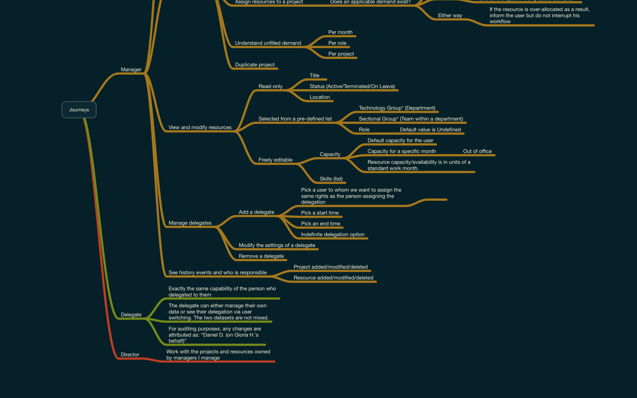
My first step was to understand where everything had gone wrong. Who were their users? What were their goals? From there I could see the right way forward to the tool they wished they knew how to ask for.
A problem well-understood is half solved. That’s why research is the most important part of my process. I discovered that humans were doing hours of tedious mental labor that a computer could do for them. Their software wasn’t presenting the right information at the right time.
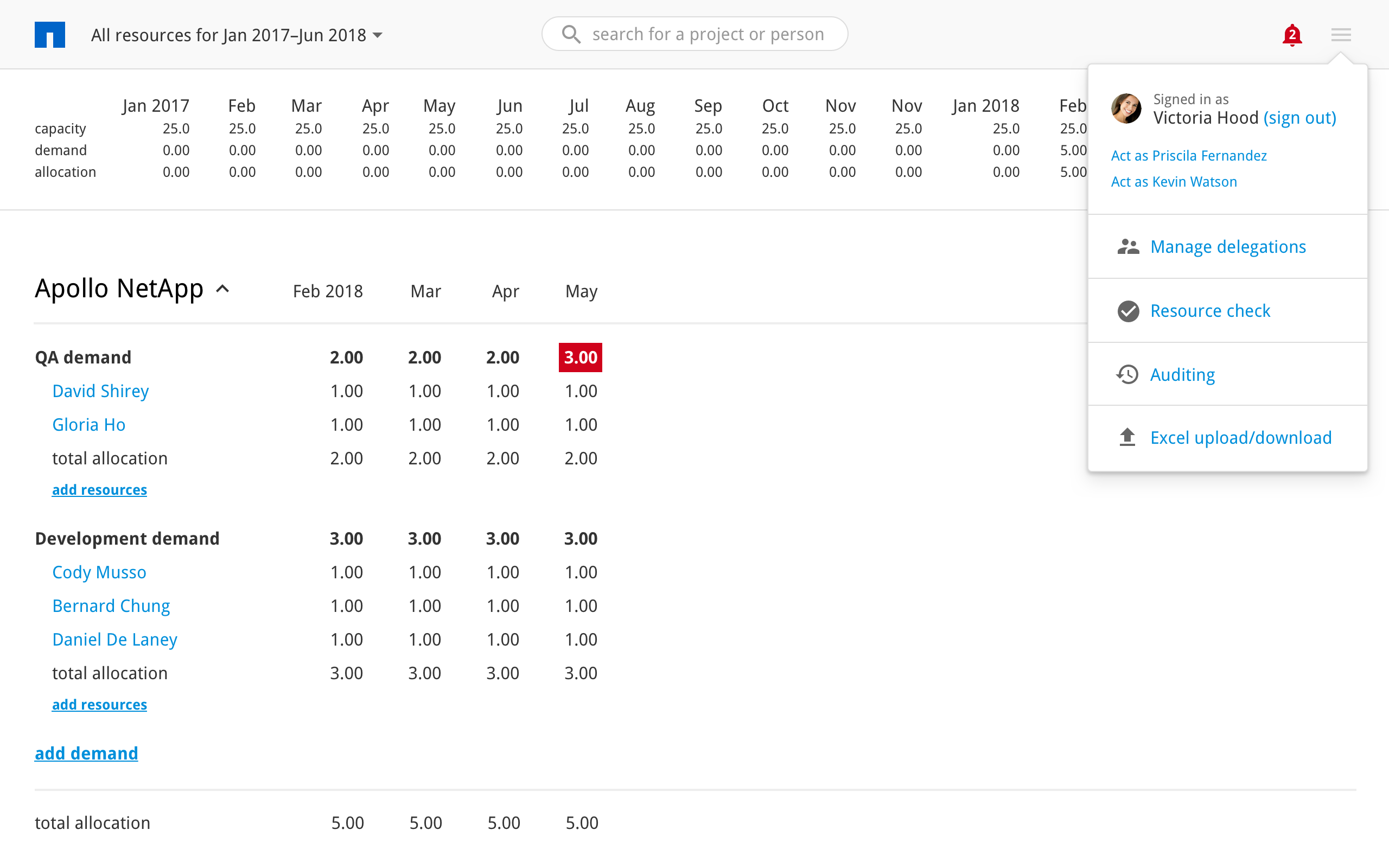
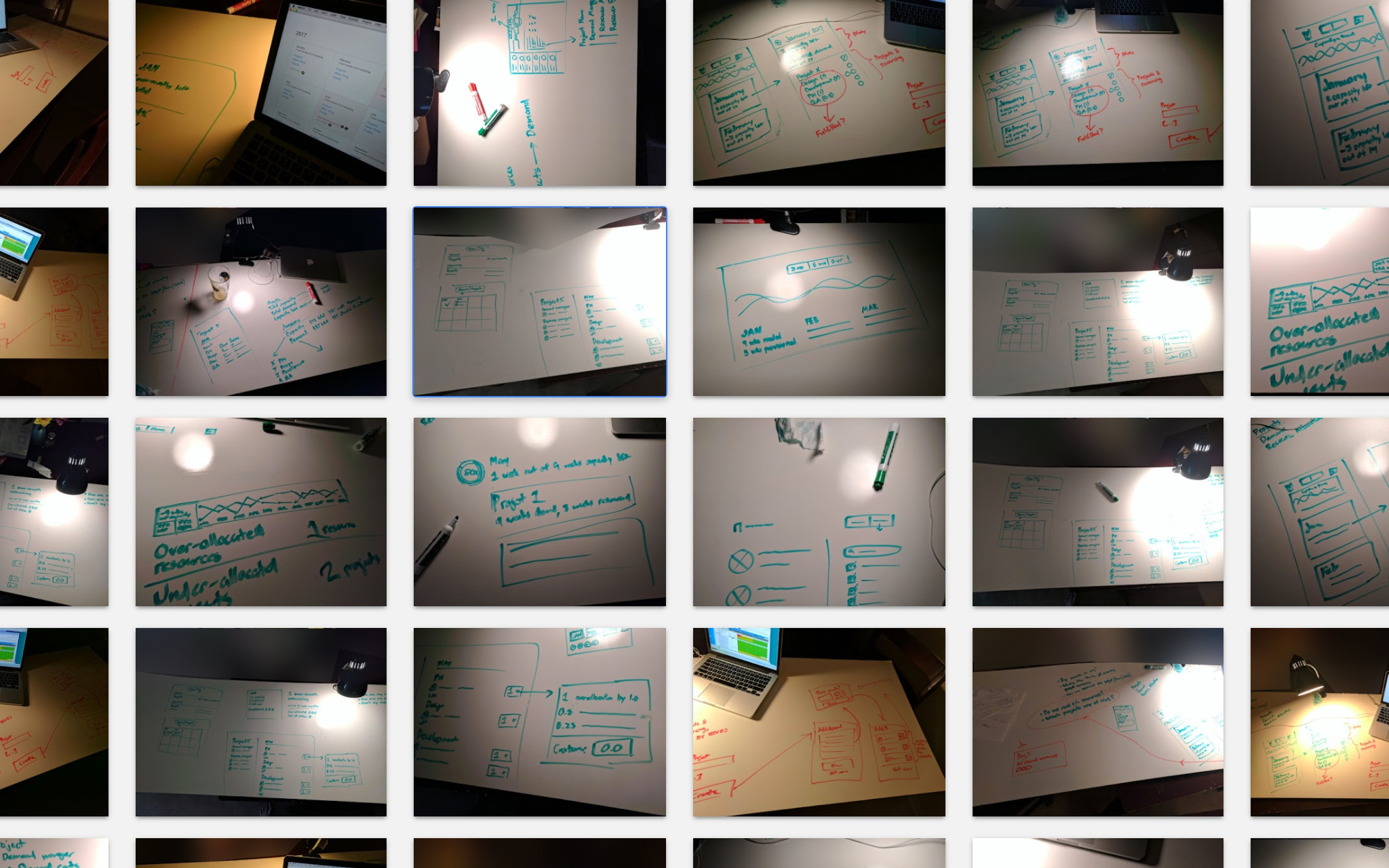
Smart planning requires seeing the big picture and specific details at the same time. We had to display a lot of information at once and help them make sense of it. There are many ways to do that wrong and only a few ways to do it right. I went through dozens of sketches before arriving at a solid direction.
While the interface would have to be flexible, it would also need to lead the user to the right conclusions. By providing contextual tips, we could cut guesswork and make the user more efficient.
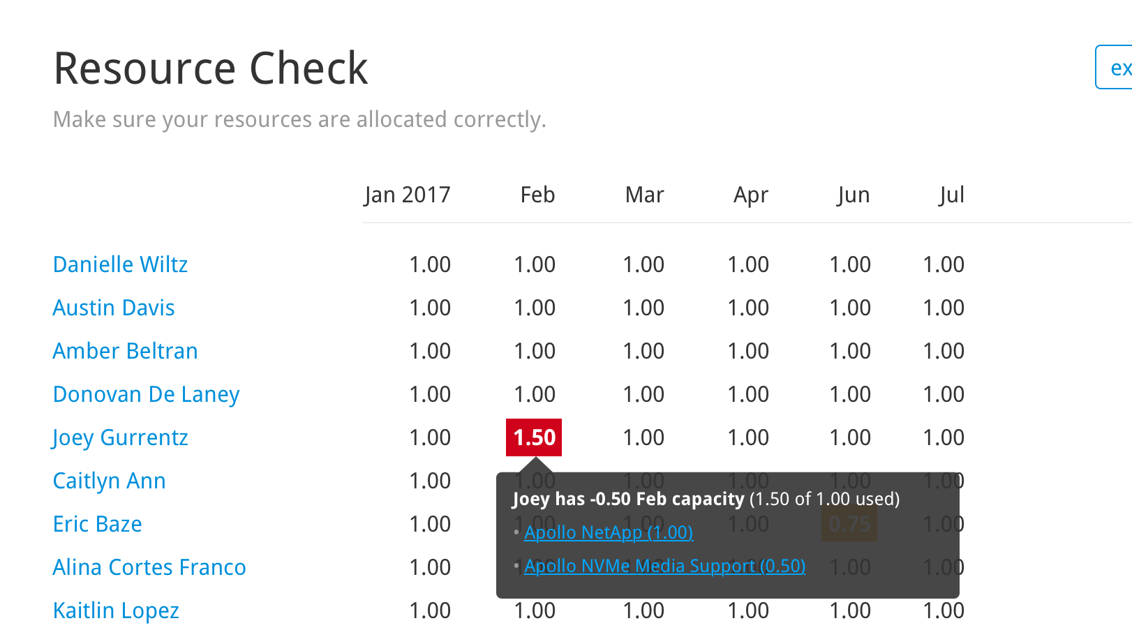
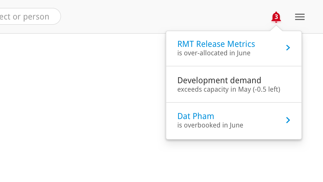
One of the biggest deficiencies of the old system was that it didn’t alert users to upcoming issues. It didn’t offer any help solving them, either. These major omissions defeat the purpose of a planning tool.
Instead of making the user find problems on his own, I designed an alert system. Any conflict or discrepancy is obvious when the user first opens the product. (I’ve recommended e-mail alerts as well.)
When working with dense data, I strip everything down to the essentials. It’s hard enough to see what’s going on in a windstorm of information without having to contend with decoration.
Often, designers use still images to communicate screen designs. In my experience, clickable prototypes are non-negotiable. Nobody knows how a product works until they see it working.
(Design nerd footnote: If you haven’t tried the Craft plug-in for Sketch, you should.)
Engineering is putting the real thing together now. Preliminary testing has gone great. I’ve designed solutions to their big problems, plus enhancements they didn’t know they needed. The stakeholders can’t wait to see the product working for real. I’ll keep you posted.