Portfolio

Data center monitoring

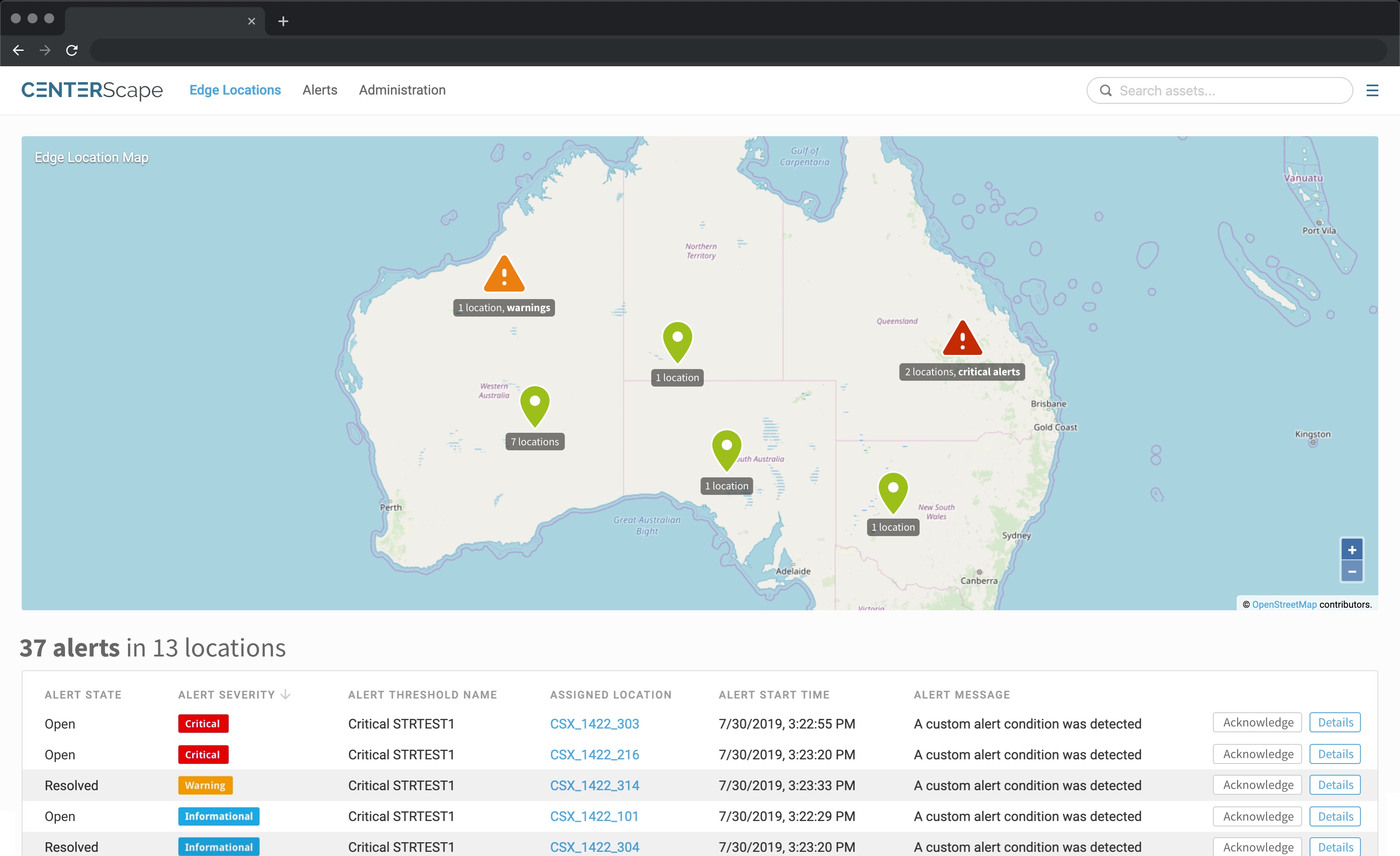
The Sentry locations view

I was the designer and product manager for Sentry, a sensor-and-monitoring product for unmanned compute sites. I also did the hardware UX, the brand, and some of the marketing materials. Regional managed service providers adopted Sentry as a standard line item in what they sold their own customers.

The challenge

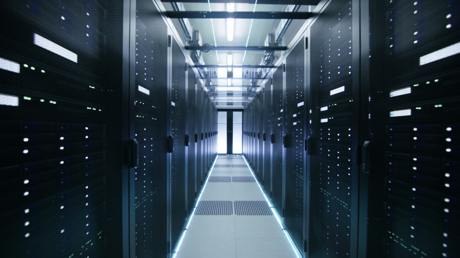
Computing runs in rooms most people never see. The big data centers have staff and process. The smaller compute sites usually don’t. They sit unmanned, with no eyes inside, until something fails. And someone is still on the hook when it does.

That someone is often a regional managed service provider. The MSP is contractually liable for sites its customers expect to keep running, but the sites are unmanned and often unreachable over the network. The MSP is completely blind to what’s happening inside, and waits for the customer to call.

The category had no good answer for them. Bigger DCIM platforms could be installed in smaller sites, but the setup was the same big project as in a real data center, and nobody wanted to commit to that. Consumer security gear (Ring, Wyze, Nest) was built for watching empty houses. Nothing in between was built for the regional MSP running sites they couldn’t see.

The product

Sentry was a single all-in-one box, often installed in a ceiling tile: thermal camera, optical camera, ambient sensors for temperature and humidity, and an external fluid leak sensor that paired with the main unit. Power via PoE Ethernet (most customers), USB-and-WiFi as a fallback. Pair it with a QR code, give it a location, and it starts reporting.

On the software side: sign in, see a list of your locations. Drill into one to see what’s happening inside: metrics over time and alerts threaded in. Admin for users and policies sat alongside.

I designed it, specified it for engineering, and managed it from sensor LEDs to dashboard.

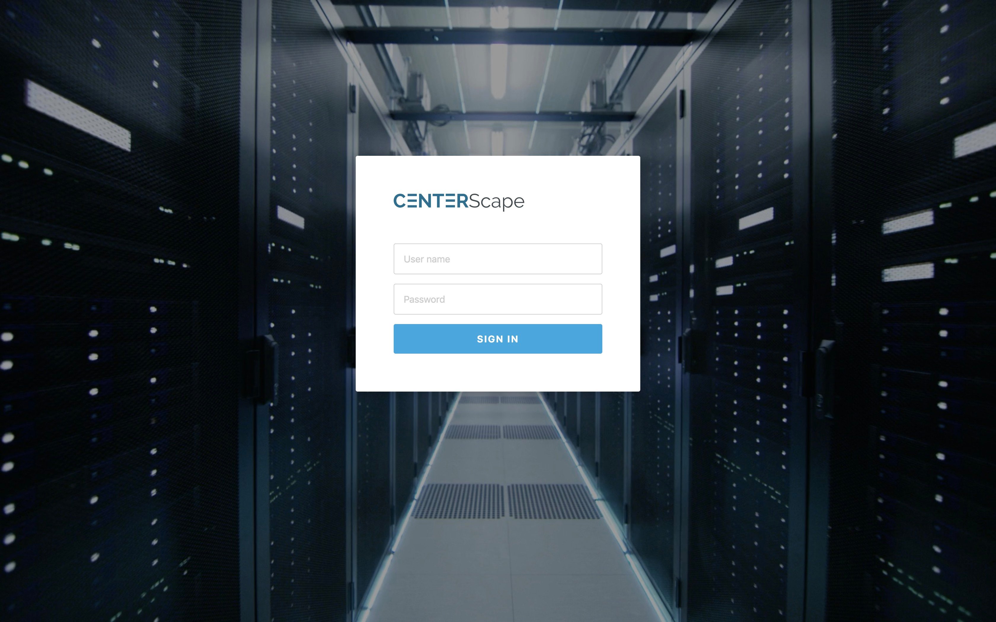
Sentry sign-in

Finding the job

Sentry started in a conversation between the CEO and a large retail customer. The retailer had compute equipment in unmanned sites across its stores and wanted to monitor it. We built a prototype.

With the prototype in hand, the actual market came into focus. The retailer’s problem was real, but the segment that needed it most was the regional MSPs already liable for sites they couldn’t see. They didn’t need a better DCIM. They needed any eyes at all.

We oriented the product around them. The conversations got specific, and so did the roadmap.

Decisions

A few calls mattered more than the rest.

Thermal as the killer feature, with optical as the reference. The thermal camera was the previous PM’s call. What I added: the UX of how operators saw it, and the marketing of how we sold it. Most thermal cameras show a heat map: a colored gradient over a grid. That tells you relatively hot versus relatively cool, but data-center equipment runs hot anyway. The real question isn’t where’s the heat but is it hotter than acceptable? I designed the thermal view as a grid of estimated temperature numbers overlaid on the optical image, so operators could see what was hot and how hot, in degrees, against the equipment, in one glance. I also pushed for thermal as the lead in our marketing. See “Two fires,” below.

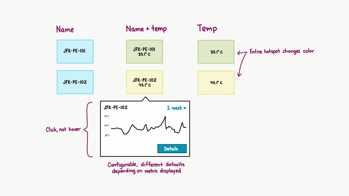
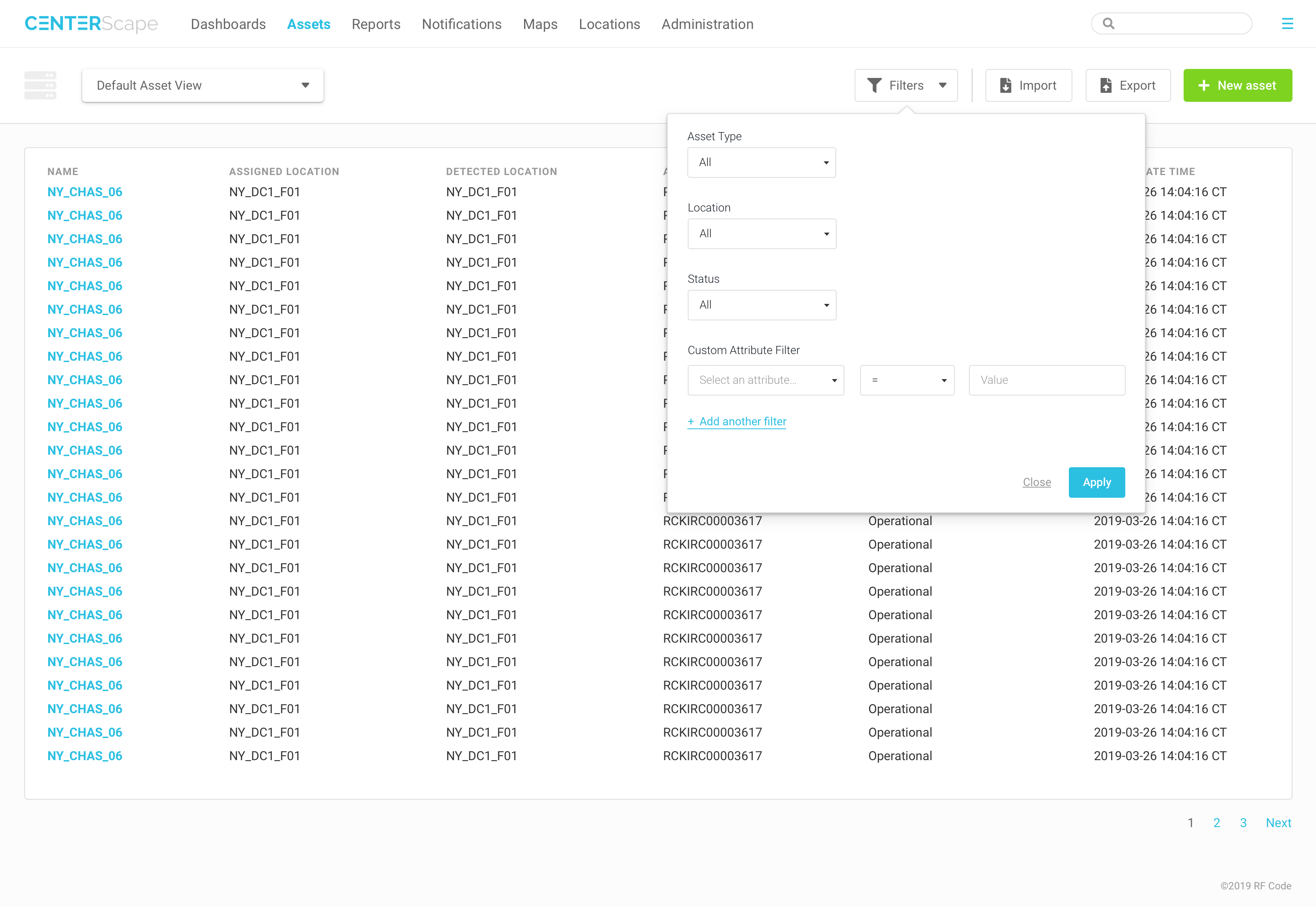
The Sentry locations list, the top-level surface after sign-in

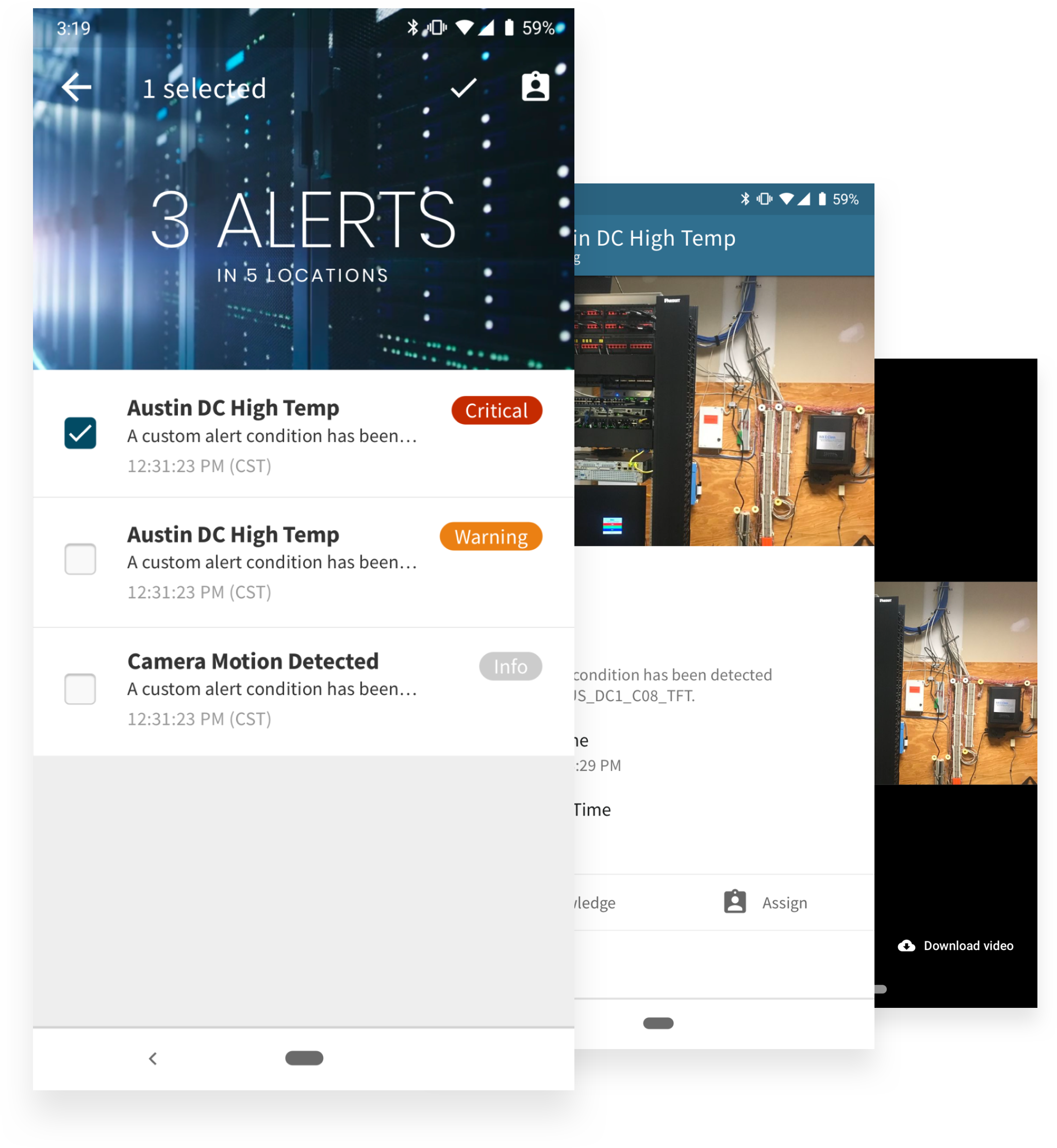
Email alerts instead of custom integrations. Every incident tool already accepts email. PagerDuty and ServiceNow ingested our email alerts natively. Building integrations would have meant maintaining them forever; email worked for every tool, and for the tools customers would pick later.

The alert email

Kill the unified dashboard. An early version had a cross-location dashboard that aggregated alerts by category. Customers preferred to handle alerts in their existing tools (PagerDuty, ServiceNow), where they already worked, and our dashboard was a worse version of a tool they already had. We killed it and put what they actually wanted on sign-in: a flat list of their locations.

Alert timeline → correlatable grid. The per-location screen needed to answer two questions for operators: what’s changing over time, and what’s changing together? Heat rising with humidity stable usually meant HVAC or equipment trouble. Heat and humidity rising together usually meant a door left open. The first version showed alerts on a timeline, which answered neither cleanly. The redesign put every metric on a synchronized grid (temperature, humidity, motion, alerts) so the correlations were visible at a glance.

The grid view: metrics on a synchronized timeline so correlations are visible at a glance

LED state machine. I designed how the sensor’s status LEDs communicated its state.

The LED state reference

QR-code pairing. Setup was a QR code on the phone that the device read with its camera. For PoE customers, the QR carried the pairing info. For WiFi, it also embedded the network credentials, so the device could come online and authenticate before anything else.

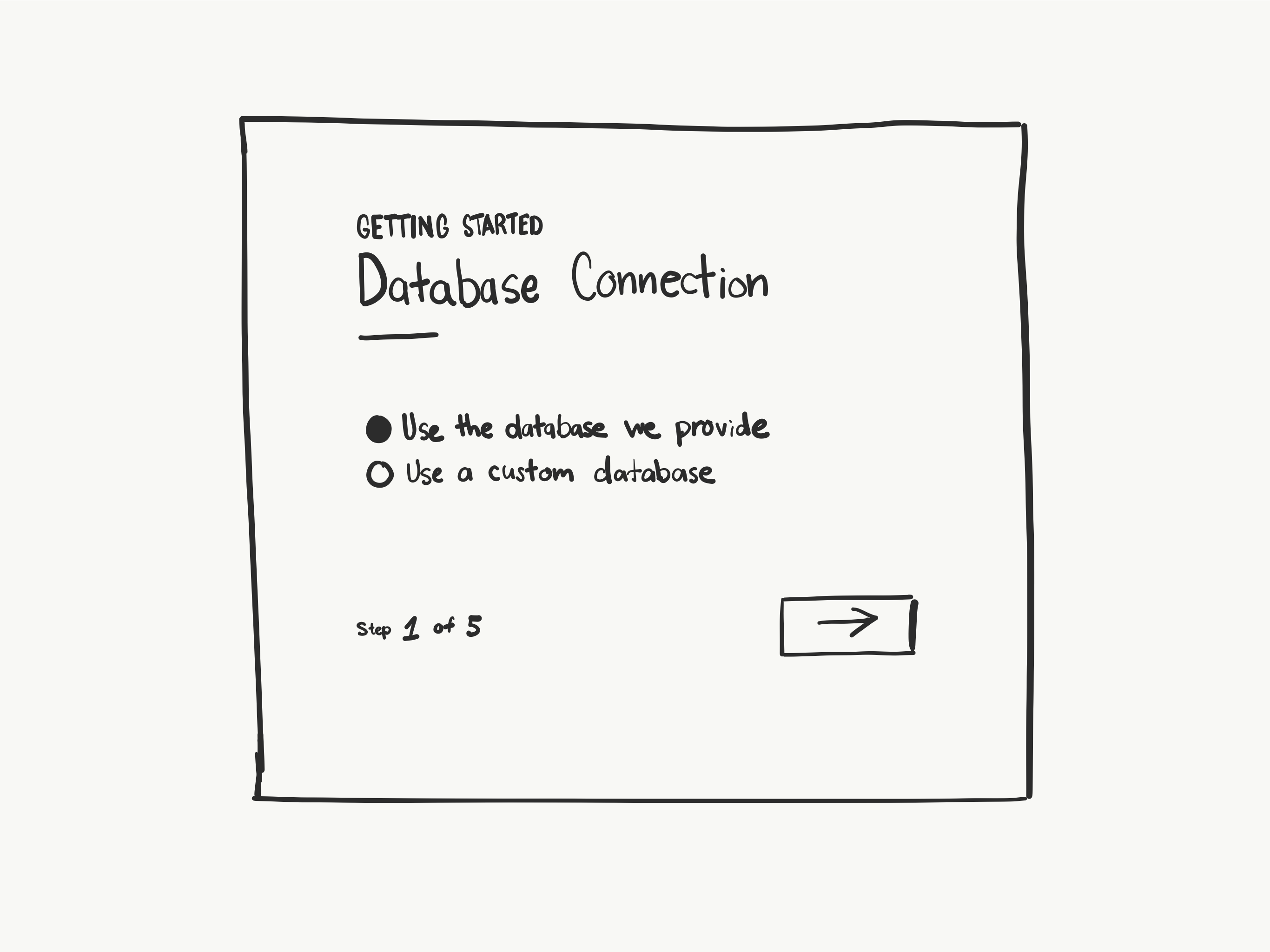
The pairing flow, end-to-end

Two fires

The thermal camera caught two of them.

A generator caught fire in a large US retailer’s data center. The smoke detectors hadn’t gone off; ambient temperature in the room was still well within range. The thermal camera saw the hot spot first, raised the alert, and the operators got there before any of the room’s other alarms went off.

The second was a server fire at a regional MSP’s customer site. The thermal camera caught it before any other alarm noticed.

Camera zones

A later expansion brought zone-based motion and thermal monitoring into the same product. I led the competitive analysis (Ring, Wyze, SimpliSafe, Nest) and designed the configuration flow.

Brand and marketing

The everything-er role included the brand. I designed the favicon and identity system, the color-coded sensor iconography, and some of the materials used at trade shows and in sales.

Designing for sixteen pixels. The favicon took a few rounds to get right. The physical device, photographed and reduced to 16×16, was an illegible blob. An illustrated version was still blurry at favicon size. The final mark was optically corrected (features oversized and markers repositioned) so the small version reads as the same object as the large one.

A five-panel favicon study: the physical device, the same photo reduced to 16×16 and illegible, a reduced-detail illustration, the illustration reduced to 16×16 and still blurry, and the final optically-corrected mark that reads at favicon size

The same visual language carried into the trade-show stand and the pitch deck.

Trade-show event banner Deck slide for the sales pitch

Design system

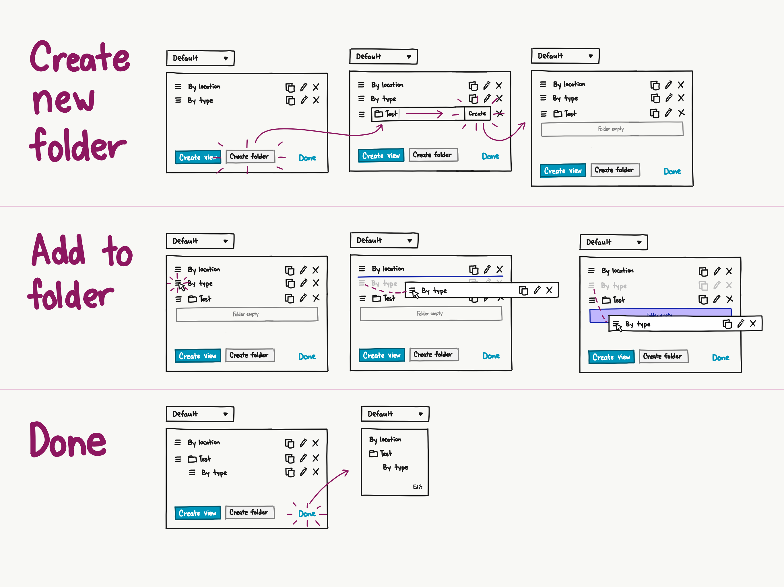
I built the shared asset library the team (and I) used to compose new screens. It saved a lot of time and kept the visual language coherent as the product grew.

Asset library

Shipping it

This was before the AI revolution. Shipping meant writing stories in JIRA, prioritizing the backlog, debugging performance with engineers in Slack, standing up in standups, and contributing CSS where it helped.

Running a UX internship

I ran the company’s first UX internship program. I did it backwards from the outcome:

The first thing I asked the intern to do was write a job description for her dream job. I told her to pick a specific company and describe her day to day responsibilities. I did this for two reasons. First, I wanted her to imagine the future she wanted so that she would be motivated to achieve it. Second, I wanted to design the program around the outcome she wanted.

I had designed a template for the program already, but her dream job description allowed me to remake that template into something for her specifically. I changed the schedule to match the job she wanted. I adjusted the books I recommended, and the work I gave her.

Throughout the program we kept her internship case study up to date and revised it as we went.

What I’d do differently today

Most of the time I spent translating design into engineering specs would be spent in code now. The loop from “noticed something in the wild” to “shipped fix” would be hours, not weeks. Designing and managing at the same time was the right way to work even then. Now the same person can also build.